
Monday, 16 December 2013
Friday, 13 December 2013
Double Page Spread - Analysis

This double page spread is taken from a Cosmopolitan magazine. It's an interview featuring Jennifer Lawrence, who is described in the introduction as a "rising star". The introduction to the interview is placed under the headline. This informs the reader who the interviewee is, and will sometimes briefly mention an upcoming film, tour, song, album, or event that has happened. It might also include the name of the interviewer.
The headline for this double spread reads "Jennifer's Mystique". Mystique is the name of Lawrence's character in her film X-Men: First Class, so Cosmopolitan has incorporated this element of Lawrence's career into the article. The word "mystique" has connotations of glamour, mystery and allure. Lawrence is seen as a fashion icon, especially on red carpets where she's at her most glamorous, so the connotation of glamour is shown here. The magazine has also referred to Lawrence by just "Jennifer", her first name. This instantly makes the interview personal to the reader. It makes the reader assume the interview is personal and that perhaps they will be reading a personal interview.
The main image for the interview is an image of Jennifer Lawrence. The photo is a close up from her shoulders up. Her clothes and make up are very classy - nothing has been overdone or seems too extravagant. Lawrence is making eye contact with the camera and her facial expression is fairly serious. This sets the tone of the interview. The reader can assume that the interview will probably be based around any work she has coming up, and not really about her personal life. If she was doing a crazy pose with an over the top facial expression, the reader may assume the interview would be about personal life and secrets and such, but the fact that Lawrence seems serious in the photo, with the word "mystique" in the headline, tells the reader that the interview is going to be mostly quite serious. There is a small caption by the image of Lawrence that reads "Young, determined and ready to take on the world". This is a small caption for the main image.
At the top of the page it says "cosmo upfront". This is what Cosmopolitan lists their interviews under. 'Upfront' is a good word to use because it tells the reader that the interviewee is not going to hold anything back in the interview. At the bottom of the page, there is the date of the issue, the name of the magazine, and the page number. The words are black and red. These are the two colours used for the text on the rest of the page, so it fits in with the theme of the page.
Casualty - Female Representation
- Woman talks down to man, breaks stereotype of male dominance.
- Female paramedic is superior over the male - female is first on the scene.
- Women are not sexualised. They're seen in doctor's uniform and paramedic uniform, so they're not seen as sexual objects. The doctor and nurses uniforms are blue which is often stereotyped as a male colour, so there's still that element of male dominance.
- Paramedics are often male-dominated roles - female paramedic differs from this.
- The head of the hospital is a female so this breaks the stereotype and is another way that females are represented as superior against males.
- All the nurses and doctors around the patient are female which represents power and intelligence from women.
Friday, 15 November 2013


Magazine Cover Draft 2

I stuck with the name 'Paradise' for my second magazine cover draft because of the word's connotations of freedom, relaxation, and peace and the fact it's the name of a cocktail. The magazine is aimed at 18-35 year olds.
The main image I have used for my second draft magazine cover is of Taylor Swift. This woman is 23 years old and falls into my magazine's target audience so she's an ideal figure to use on the magazine cover. Swift is often seen as a fashion icon and influences a lot of women's fashion, so the cover image may persuade the audience to buy the magazine on this alone. I've put her whole name on the cover because I see this as quite a sophisticated, straight forward thing to do. I am trying to give the magazine a sophisticated edge so this works well. "Songs, Styles and Secrets Spilled" is a reference to Swift's profession and personal life. Swift is a renowned singer-songwriter and is known to write a lot of personal songs about life and love - her famous other half's in particular. Hearing about "songs" would interest Swift's fans because they are always eager to hear her personal insight into her songs. Swift has fans of all ages, so this will draw in the 18-35 year olds also. "Styles" is a reference to not only her personal styles, but to her recent ex-boyfriend Harry Styles. Her relationship with Styles was scrutinised by the media, so readers will be highly interested in reading about what she has to say on the matter. The link to a relationship will also interest readers who fall into my target audience because they'll want to read any gossip spilled by Swift on the relationship. Finally, "secrets" will definitely intrigue readers because it gives them a personal insight into Swift's life. Women are stereotypically seen as gossips, so learning about Swift's "secrets spilled" is bound to interest my target audience. I believe the cover image and its cover line will draw readers of the target audience in.
The colours I have used for the text on the cover are yellow, dark purple, white and black. I took the yellow and dark purple from the cover image, and decided that white and black would stand out against the image well. Yellow is the colour of Swift's dress so I saw this as a prominent colour to use from the image. Dark purple is the colour of her lips which is a less prominent colour but I felt its subtleness would be effective. I also felt that black and white were good, strong colours to use on the cover. They would contrast against the background to stand out, and would also make the cover more neutral. I didn't want to add too many colours to the cover because I realised from research that magazines aimed at 18-35 year olds don't use too many colours. They use bursts of colour in certain places to make them stand out. This is what I took into account when making this draft. I ensured I spaced out the colour on the cover as well, so the same colour wasn't found in the same place too often. I believe doing this makes the cover more pleasing to the eye. I used yellow for the main title because it's the colour of Swift's skirt which I think makes it the most prominent colour. The main image has a slight yellow tint to it, so it was the best colour to use. I also made Swift's head from the main image sit in front of the main title. This is seen on magazine's that are widely known around the world - usually the magazine is easily recognisable from conventions used on the cover like font, colours and layout. The main title doesn't always have to be fully shown because its recognisable and draws more attention towards the main image/famous person on the front. I have done this on my draft because although the magazine I'm creating isn't widely known, Swift's head doesn't cover too much of the title, so it puts the audience under the impression that it's well known.
I stuck to using rule of thirds for my magazine cover. I did this by inserting two guide lines on my image on Photoshop to get this:

I stuck to using rule of thirds for my magazine cover. I did this by inserting two guide lines on my image on Photoshop to get this:

I did this to ensure that the layout of the cover would be the best it could be. I think this was effective in improving the overall layout of my magazine cover.
The cover lines I created for this cover all relate to my magazine's target audience of females aged between 18-35. "101 Back To Work Outfits" is effective because people in this age group go to work and they'll need inspiration for outfits. The bold "WIN" in yellow draws people into the magazine because it's obvious there's goodies to be won. Women buying fashion ma
Monday, 11 November 2013
Magazine Cover Draft 1

The name of my magazine is 'Paradise'. This word has the connotation of freedom, relaxation, and peace, so I believe it's a strong name for the magazine. Paradise is also the name of a cocktail. My magazine is aimed at 18-35 year olds, and it's reasonable to say that the majority of people in the age group will drink from time to time, so the reference to the name of a cocktail also will be a link to my magazine's target audience.
The main image I have used for my draft cover is of Jessica Alba. Jessica Alba is 32 years old, so she falls into the target audience, making her an ideal person for the cover image. She's well known to the target audience, so people may be persuaded to buy it just because she's on the front. She's known to be very fashionable and influential, so women may be interested in what she has to say. From analysing a Glamour magazine cover, I noticed that they name the celebrity by their first name to make the magazine seem more personal for the reader. I have taken this idea on board for the draft because I feel it's a really good way to draw people into buying the magazine because of the personal basis of referring to them by their first name. "The Road To Recovery" was the subtitle I wanted to use under her name. I believe this already tells the reader that the audience will see into her life and how she's recovering. The subtitle is quite vague - the audience won't know what's happened to her and what she's recovering from, so this makes the audience want to buy the magazine and find out what's happened. Her talking about her "recovery" is another way that the magazine is made to be more personal towards the audience. Letting us know about her recovery makes the reader feel important - that we're special enough to be let into her life.
The colours I have used for the text on the cover are black, blue, pink and white. These are all variations of the colours from the main image. The shadows on Jessica Alba's face are quite heavy, so black would be a suitable colour for text. The light blue was a variation from the dark blue on her dress. I didn't want to use dark blue because it wouldn't be bright enough to stand out on the cover. The pink is a brighter colour from her lips. Her lips are rosy coloured, and the colour would pop off the screen and stand out, so pink was a good colour. I finally used white because the left side of the photo is brightly exposed, making it a bright photo, so white would balance out the other bright colours well. The main title is pink because from all the colours I decided to use, this colour was the boldest and would stand out the most. The main title is designed to stand out and draw the reader's attention, so it was important to use a colour that would stand out. For the rest of the cover lines, I used colours that would stand out the most against their background so that the text wouldn't blend into the background and would be difficult to read. I also ensured that I didn't use too much of the same colour in one area. I used roughly the same colour the same number of times in even areas around the cover to make it aesthetically pleasing.
I checked that I was using the rule of thirds with my cover by adding two guides like this:
 I ensured that the cover lines stayed in the guides and didn't move out. To improve the rule of thirds with this draft, I could have moved the image so that Jessica Alba's whole face was in the middle third, but I believe that having half of her face in the middle third would work just as well in this case.
The cover lines I created for the cover all relate to the women who fall into my target audience. "Set Trends This Summer WITHOUT Breaking The Bank" is effective because 18-35 is an age where money can begin to become an issue. Shopping is a guilty pleasure for most women, so being able to shop "without breaking the bank" is important for women. The capitalisation of "without" is to draw more attention to that cover line. "Flawless Skin" is in a bigger font because having good skin is an important thing for women. Appearance is something 18-35 year olds take seriously, so "Summer Skincare Tips From The Experts" will be something they'll find useful, so therefore will draw the target audience in. Having the word "experts" in there makes the information more trustworthy so the women will be more likely to buy the magazine and believe what they read. Society will trust most things "experts" say, so putting this on the cover will draw people in. 18-35 is also the age that people start beginning relationships and usually start to settle down (in latter end of the age group), so trying to find the best man for them is something they'll be interested in. The cover line "Read His Mind" is in a bigger font to draw attention towards it. Reading minds is something women would love to be able to do, so reading "his" mind would be even better. Saying "his" is indirect, but usually the reader will have somebody in mind. This will, again, make the cover more personal and will make the audience want to buy the magazine more. "53 Foods That Will Get You That Summer Body" is another reference about women caring about their appearance. 53 is quite an obscure number and will intrigue the audience. It's also a high number so the audience will know they'll be getting plenty of information. Women tend to have to be guided with healthy eating so that they know they're eating exactly what they should be, so this cover line will appeal to women in the age group. All of the cover lines have been coloured appropriately and have been thought out in order for them to appeal to my target audience.
I'm really happy with my first magazine cover draft. I believe all the aspects of the magazine will draw women into buying it, so I'm overall very pleased with the first draft.
The main image I have used for my draft cover is of Jessica Alba. Jessica Alba is 32 years old, so she falls into the target audience, making her an ideal person for the cover image. She's well known to the target audience, so people may be persuaded to buy it just because she's on the front. She's known to be very fashionable and influential, so women may be interested in what she has to say. From analysing a Glamour magazine cover, I noticed that they name the celebrity by their first name to make the magazine seem more personal for the reader. I have taken this idea on board for the draft because I feel it's a really good way to draw people into buying the magazine because of the personal basis of referring to them by their first name. "The Road To Recovery" was the subtitle I wanted to use under her name. I believe this already tells the reader that the audience will see into her life and how she's recovering. The subtitle is quite vague - the audience won't know what's happened to her and what she's recovering from, so this makes the audience want to buy the magazine and find out what's happened. Her talking about her "recovery" is another way that the magazine is made to be more personal towards the audience. Letting us know about her recovery makes the reader feel important - that we're special enough to be let into her life.
The colours I have used for the text on the cover are black, blue, pink and white. These are all variations of the colours from the main image. The shadows on Jessica Alba's face are quite heavy, so black would be a suitable colour for text. The light blue was a variation from the dark blue on her dress. I didn't want to use dark blue because it wouldn't be bright enough to stand out on the cover. The pink is a brighter colour from her lips. Her lips are rosy coloured, and the colour would pop off the screen and stand out, so pink was a good colour. I finally used white because the left side of the photo is brightly exposed, making it a bright photo, so white would balance out the other bright colours well. The main title is pink because from all the colours I decided to use, this colour was the boldest and would stand out the most. The main title is designed to stand out and draw the reader's attention, so it was important to use a colour that would stand out. For the rest of the cover lines, I used colours that would stand out the most against their background so that the text wouldn't blend into the background and would be difficult to read. I also ensured that I didn't use too much of the same colour in one area. I used roughly the same colour the same number of times in even areas around the cover to make it aesthetically pleasing.
I checked that I was using the rule of thirds with my cover by adding two guides like this:

The cover lines I created for the cover all relate to the women who fall into my target audience. "Set Trends This Summer WITHOUT Breaking The Bank" is effective because 18-35 is an age where money can begin to become an issue. Shopping is a guilty pleasure for most women, so being able to shop "without breaking the bank" is important for women. The capitalisation of "without" is to draw more attention to that cover line. "Flawless Skin" is in a bigger font because having good skin is an important thing for women. Appearance is something 18-35 year olds take seriously, so "Summer Skincare Tips From The Experts" will be something they'll find useful, so therefore will draw the target audience in. Having the word "experts" in there makes the information more trustworthy so the women will be more likely to buy the magazine and believe what they read. Society will trust most things "experts" say, so putting this on the cover will draw people in. 18-35 is also the age that people start beginning relationships and usually start to settle down (in latter end of the age group), so trying to find the best man for them is something they'll be interested in. The cover line "Read His Mind" is in a bigger font to draw attention towards it. Reading minds is something women would love to be able to do, so reading "his" mind would be even better. Saying "his" is indirect, but usually the reader will have somebody in mind. This will, again, make the cover more personal and will make the audience want to buy the magazine more. "53 Foods That Will Get You That Summer Body" is another reference about women caring about their appearance. 53 is quite an obscure number and will intrigue the audience. It's also a high number so the audience will know they'll be getting plenty of information. Women tend to have to be guided with healthy eating so that they know they're eating exactly what they should be, so this cover line will appeal to women in the age group. All of the cover lines have been coloured appropriately and have been thought out in order for them to appeal to my target audience.
I'm really happy with my first magazine cover draft. I believe all the aspects of the magazine will draw women into buying it, so I'm overall very pleased with the first draft.
Monday, 14 October 2013
Progress - Week 1
This week, I've created two blog posts analysing magazine covers. I found it really helpful to analyse these two covers because it gave me a wider knowledge of how magazine companies set their cover's out to attract people from their target audience. I'm pleased with my progress so far in my coursework research.
Cosmopolitan Magazine - Textual Analysis

This is a May 2011 issue of Cosmopolitan magazine. It is aimed at women aged between 18 and 35. The magazine is known for its articles on sex, relationships, fashion & beauty, health and celebrities. This is why the magazine is aimed at people over the age of 18 - these people will find the articles inside more relatable. I think women over the age of 35 will be mostly uninterested in the magazine because women will mostly be settling down at this age. They won't feel the need to read about "sex moves men craves" and how to "look sexy" on a first date. Women who do fall into that age group, however, will want to know about these sorts of things in order to find their perfect man. 18-35 is a very mainstream audience who often read magazines, so Cosmopolitan appeals to that audience.
Hayley Williams is the feature for that month's magazine. She's known for her rock band Paramore. The colours of the magazine cover represent this. The deep red isn't often found on a magazine aimed at women because it's not a very feminine colour, so this represents Hayley Williams' background. It also matches her hair which is a clear example of the magazine using a colour from the main image to use for the text around the cover. The light blue background is a similar colour to her dress, so this is another link between colours used on the cover and the colours from the main image.
The cover lines feature many words that have been enlarged to attract more attention to them like "sexy" and "sex moves". Each colour used on the cover contrast with each other to stand out more, so these words being in red and white, as well as being enlarged, attracts more attention towards them. The cover lines are mostly about impressing men, so they make it clear who the magazine is aimed at. They also help to appeal to women who fall into the age group of 18-35 because not an awful lot of women will have settled down by this time, so they'll want good tips to attract men to settle down with. Cosmopolitan is a very popular and trusted magazine, so women will follow tips given by it.
These are the main factors I've gathered from this magazine:
- Cosmopolitan uses a lot of sex-related cover lines to attract their audience
- 18-35 is a mainstream age group for magazines aimed at women who haven't yet settled down with a man
- Colours for the main title and cover lines are taken from the main image
- Words in the cover lines are in a colour that contrasts and are enlarged to attract more attention to them and therefore will attract to more people from their target audience
- Trusted magazines that have been running for years will offer tips for certain things in the cover lines
Friday, 11 October 2013
Glamour Magazine - Textual Analysis

This is a November 2012 issue of Glamour magazine, with Taylor Swift being that month's feature. The magazine is aimed at an audience of 18-35. This age group is a very mainstream audience. The cover title is half covered by Swift's head which tells the audience the magazine is very well known, and instantly recognisable without seeing the cover title. Every issue features a well known female celebrity on the front cover who falls into this age category. This can attract not only the repeat customers/subscribers of the magazine, but fans of the famous woman on that month's issue. The woman is normally slim, has heavy make up, is dressed in very classy, fashionable clothing, and always makes direct eye contact with the camera. This makes the magazine more personal and the audience will be more drawn towards it. Swift's facial expression is warm - she has a soft expression which will invite people to buy the magazine. Her pose is theatrical and over the top which is an element of glamour, which obviously links to the magazine name.
The title on each Glamour magazine changes colour to match the theme of the main image. For example, Swift's dress is a hot pink colour, as is her lipstick, so the cover title is the same colour to match. The cover title colour also matches the subtitles of the cover lines around the page. The main colours used for the text are hot pink, white, light blue, and black. Light blue is quite a feminine colour, as is white and black when used with two other feminine colours. The colours are mostly warm which is inviting for the audience.
The cover lines on the magazine persuade are inviting to it's target audience. Certain words have been bolded to draw more attention to them. For example, "Style" has been enlarged above the smaller lines "The Do's & Don'ts of Fall Fashion" which tells the audience the magazine will explore fall fashion, and what's stylish now. Glamour is a trusted magazine by many women across the world, so they'll be likely to follow advice given by the magazine. Also, Swift's first name "Taylor" has been enlarged in the same hot pink colour as the cover title. Referring to her by her first name makes the audience expect a personal interview inside because the magazine and her are on first name basis. It also makes the reader feel more connected to her because the smaller text underneath reads "Stuff She Only Tells Her Girlfriends". The cover has been intentionally edited to make the audience feel like more of a friend of Swift's, and not just somebody reading her interview.
These are the main factors of the magazine cover that I have gathered:
- The main image is always a women, and they always fall into the magazine's target audience.
- The woman always makes direct eye contact with the camera.
- The cover title is a colour that matches a colour from the main image, and this same colour is used on some of the cover lines around the page.
- The colours used on the cover title and cover lines are feminine colours.
- The cover lines use enlarged words in a bold colour to persuade more people to buy the magazine.
- The cover is designed to make the audience feel like more of a friend of the celebrity in the main image i.e. first name basis.
Sunday, 6 October 2013
The Hunger Games - Textual Analysis
The Hunger Games is an adventure film based in the post-apocolyptic future. It revolves around a televised annual event in which boys and girls (a boy and a girl from each district) fight to the death. The boys and girls are picked from a reaping, and they're sent to a city named Panem.
Visual Codes
- We see the character Katniss calmly running around a run-down area. Could be trying to escape from the troubles at home.
- We see her duck under a barbed wire fence to get to the other side. The camera briefly shows a danger sign, so we're under the impression that she shouldn't be there because it's dangerous.
- She sits down with a character named Gale, they talk closely like friends, but could be possible love interests.
- A big blimp appears and the leaves around the forest whirl in the wind - represents danger and vulnerability. Katniss and Gale have confused/worried expressions.
- Big gathering (probably of whole town/district), everyone's in formal clothing, smart event.
- There's armed, uniformed guards scattered around - tells us there could be danger, puts the audience in a curious mindset as to why they're there.
- Katniss and her younger sister Primrose are holding hands - they could be worried about the event so they're consoling each other.
- Eye contact is made between Katniss and Gale who were seen together previously - shows there's care between the two, audience is given the impression there's more than friendly feelings between them.
- The guards are holding back a screaming Katniss because Primrose was picked in the reaping - her sad screaming makes the audience feel sympathetic for her.
- Worried look between Katniss and fellow contestant Peeta - shows they're in it together, but worried for what's to come.
- High speed train sets the scene - futuristic, modern - contrasts between the previously seen setting. The shot of the city Panem is very modern, so the audience knows this city is an overall wealthier one than the district.
- Interview between the man Caesar and Katniss is awkward - Caesar is smiling but Katniss is glum - shows she's nervous about the games.
- Small, young girl Rue shies away from the rest of the contestants. Katniss smiles at her - may remind her of her sister Primrose.
- Combat practise scenes - shows which contestants know how to fight. Violent skills - shows some contestants have previous knowledge of how to fight.
- Peeta and Katniss bond alone together - could be the start of a love interest between the two.
- Light cast behind Katniss walking gives the audience an intense feeling.
- Mockingjay badge is shown - represents freedom - something some of the contestants wish they had.
- Movie symbol is shown as the Mockingjay at the end of the trailer - its denotation is a mockingjay, but the connotations of that are freedom and defiance. The mockingjay is on fire, which shows the lack of freedom there is in the film.
Audio Codes
- Eerie constant low sound, sounds vacant and mysterious, non diegetic.
- Blimp makes a huge whooshing sound which is unsettling, diegetic.
- Katniss talks to Primrose with a hushed tone to calm her down.
- Non diegetic ticking sound as name is picked out at reaping, very tense.
- Single banging noise as name is read out, a hard hitting noise, like it's hit the audience that Primrose was called out.
- All sounds stop when Katniss volunteers - very serious, lets the audience focus just on Katniss.
- Non diegetic ticking noise builds up again as both names are read out, like a rising heartbeat. Builds up tension.
- Man's voice echoes like a loudspeaker, shows he's important with his voice booming over everyone.
- Makes the man seem like a narrator because he talks over numerous shots.
- Metallic sounding piercing noises as contestants throw spears emphasises the violence ensued in the film - diegetic noises.
- Hushed diegetic voices between Katniss and Peeta shows intimacy, love interests.
- Non diegetic music becomes more electric as shots are cut faster, more tense, like a sped up heartbeat.
- Booming, echoing diegetic voice counting down creates tension for what's to come - no background music now, audience concentrates on the countdown.
- Crashing non diegetic sound as the countdown gets to 0, very jumpy.
- Eerie whistle at the end of the trailer, symbolises something. Entices audience to watch the film and find out what it means. It echoes slightly which makes it creepy.
Technical Codes
- Long shot of Katniss running, sets the scene instantly.
- Handheld shot of Katniss running - more realistic, puts us in the scene.
- Close up shots of faces, used a lot in the trailer, used to focus on the character's expression.
- Extreme long shot on area Katniss and Gale are in - sets the scene again.
- Aerial shot on Gale and Katniss when the blimp flies over - makes them appear inferior to the blimp.
- Camera pans on the crowd at the reaping to emphasise how busy it is.
- Close up on Primrose's name on the paper, focuses the audience's attention on it, more dramatic. The camera shows it before the character says it, so the audience is superior and knows more than the characters.
- Peeta's P.O.V is briefly used, puts the audience in the scene with him, makes it feel more personal, like it's happening to us.
- Camera points up at Peeta and Caesar after their interview, makes them superior and the audience inferior.
- Handheld camera shot in training - shaky, makes the scene edgier.
- Tracking shot on Katniss' arrow through the air which emphasises how fast it's travelling.
- Extreme close up on mockingjay pin, shows it's important so it focuses the audience's attention purely on that. It's iconic in the film, so focuses the audience's attention on it is important.
- Extreme long shot, then a medium shot of Katniss walking towards the camera, more importance on Katniss.
- The trailer starts off with fairly slow cut shots, with a few fast cuts where the screen very, very briefly blurs. As the trailer progresses, the shots are faster, especially when the countdown is going on. It's a different shot on a different character related to Katniss in some way at each number said, shows how each character is dealing with Katniss being in the games.
- The lighting is mostly very dark because it's a gloomy themed film. The lighting is brighter on the train and in the makeup room, both of which are much more upper class locations, so it's brighter in locations that are wealthier, and gloomier in the run down district.
To conclude, the visual codes of the film show that it's an overall dark film, with the mockingjay being on fire and the glum facial expressions throughout the trailer. The audio code of music is effective in the film because it sets the mood a lot. The ticking noise which built up that was reminiscent of a heartbeat added a lot of tension. Technical codes were effectively used with the shots which were included fast cutting towards the end. All the codes work together to produce a very effective film which will instantly tell its audience a lot about the film's themes and characters.
Thursday, 3 October 2013
The Lorax - Textual Analysis
The Lorax is an animated comedy-musical for children based on Dr Seuss' novel of the same name, and it's essentially about a boy named Ted who is in love with a girl named Aubrey, who is in love with trees. Aubrey has never seen a tree before, so Ted goes on the hunt to find a tree to impress her.
Visual Codes
- Very colourful start, animation
- Cute animated flowers popping up, represents happiness and instantly tells us it's a happy film
- Young boy playing with toy aeroplane - denotation: toy plane, connotation: fun, typical of a young boy
- Pretty girl, obvious love interest
- The Lorax is bright orange, short and harmless - appealing to young children
Audio Codes
- Dreamy music at the start (soft guitar), already tells us it's a light hearted film
- Music (keyboards) builds up slightly when we see Aubrey, Ted's love interest
- American voices - American animation
- Music stops when tree gets knocked down - tells you it's a serious matter, but The Lorax's cute, small appearance softens it down
- Same song throughout - slowly builds up with more voices towards the end, shows it's an upbeat film
Technical Codes
- Many close ups of the character's faces - it's a comedy so facial expressions are important to show because the audience wants to see reactions
- Aerial shot on Aubrey and Ted lying down on the grass together - makes the scene romantic/dreamy
- Camera shakes when Ted drives past, which makes the animation seem more realistic/authentic
- The camera pans on the landscape of the trees, makes the audience feel overwhelmed by the masses of trees and how beautiful they were
- The trailer mostly consists of medium shots and close ups
The visual, audio and technical codes all work together to make a really good animation. The visual codes of the colourful animation straight away at the start of the trailer instantly tells us the film is lighthearted and fun. The audio code of the soft music also tells us that the film is upbeat and not serious. The technical codes of the often used close ups and medium shots tells us that the film doesn't get too experimental with the shots - they want to keep it simple for the audience it's aimed at - young children.
The Inbetweeners - Audience
The Inbetweeners is a E4-aired British sitcom based around four teenagers at sixth form. The intended audience for the show is 16-25 year olds because of the college environment and the younger characters. I would say, though, that people older than 25 will enjoy the show because of the comedy. It's very inappropriate at parts, but this factor of the show can make anyone of most ages laugh. The intended audience is 16-25 year olds, but I believe people up to the age of around 40 will find it funny too, despite not being able to relate to it as well as the intended audience. It's aimed at males more than females because the main characters are male. This gender dominance can attract more males to the show than it can females. The fact that the characters aren't good looking (and aren't supposed to be) won't attract females, but the fact that it's comedy could attract females. The males in the show degrade women quite a lot in the show, and only use them for failed sexual favours, so this could put women off the show. It's mostly aimed at men aged between 16-25.
The two main gratifications of the show are entertainment and social integration. It's entertainment because it's a comedy. The fact it's aired on E4, the 'E' of which stands for 'entertainment' tells us as an audience that it's going to entertain us and make us laugh. For men aged between 16-25, the show could often be watched to fill up time. A typical stereotype of men is that they sit around doing not a lot all day, so this relatable comedy for men could be a way of filling up time. It also has the gratification of social integration because of how relatable it is. People could watch it simply so they have something to talk about to their mates the next day. The show has grown to become a huge success around the UK, so socially it could be seen as strange to not watch it, which means some people might watch it just to fit in with not only their friends, but society as well.

The programme goes against the dominant ideology that all boys in college manage to get a girlfriend and go partying most nights. The main characters in the show fail to get any female attention at all, and they rarely get invited to parties. This goes against many people's impressions about college. The overall audience for the show is male 16-25 year olds.
Sherlock - Audience
Sherlock is a drama series shown on BBC One. It revolves around Sherlock Holmes and his companion John Watson solving crimes around London. The intended audience for the show are adults. This is because the show is usually based around a murder, and is overall quite a dark show. It has elements of comedy though, with Sherlock's overwhelming knowledge and witty comments to other people. Each series has three episodes, each of which are feature length. This length of time will appeal more to adults in the evening than it will to younger people. It can be intended for both males and females. The show may appeal to men because the main characters are male. This gender dominance could perhaps be more relatable to men than women. However, women could also be attracted to the show because of the men in it. The two main roles are portrayed by Benedict Cumberbatch and Martin Freeman, who are both well acclaimed actors in the industry. They're both seen as well presentable men, so the actors in the show will help the show to appeal to women, as well as men.
This show meets two main gratifications: entertainment and information. The show is a drama with elements of comedy, so people will watch it for entertainment. This could be to relax at the end of the day, filling time, or it could be escaping from problems. Sherlock is very satisfying to watch because he solves crimes with not a lot of thought at all, so you can become lost in the show. A lot of people watch TV simply to fill time, so this could be a big reason of why people watch it. The show is also a gratification of information because although the show is fictional, Sherlock's reasoning behind his thoughts on the crime are very plausible, and it's satisfying to watch him work through his thoughts and solve the crime. The show can help people become more observant of people and objects around them.

The programme is constructed around focus because the show revolves around Sherlock, the main character. As an audience, we're encouraged to focus upon him more than any of the other characters in the show. His first name is the title of the show, so the focus is already on him before anyone even starts watching it. John Watson, Sherlock's companion, is also a big character in the show, but it's fair to say that Sherlock is the focus overall.
Wednesday, 18 September 2013
Gossip Girl - Sexuality
Gossip Girl is a show that revolves around spoilt teenagers (who turn into young adults as the show progresses) who live in New York's Upper East Side. The show has been dubbed to be over-sexualised and to be a bad representation of women in the media due the women in the show being unfaithful to short-term partners. This is the only major negative portrayal in the show.
Eric is a recurring character who came out as gay halfway through the first season. His mother disapproved of his choice at first, but soon came around. This was both a negative and positive portrayal of homosexuality, because at first, his mother was ashamed of him. This is a negative representation, because it could make gay members of the audience feel ashamed of who they are. She later told him that she accepts him for who he is and she loves him, which balances out the portrayal to more positive.

The clip shows Blair talking to a man who is clearly ashamed of his sexuality and is pretending to be straight. Blair threatens to post evidence of his sexuality online, and then Eric comes in. He proudly announces that he's gay, and the man who's ashamed calls him a "faggot". This is an incredibly negative portrayal of sexuality in the show, but Eric doesn't let it phase him. He walks away, and Blair posts the evidence online. The man freaks out, still not admitting to anything.
This is a mostly negative representation of sexuality/homesexuality in the show. There's positive aspects, because Eric is proud of his sexuality and gives the man a chance to admit his secret, but when he retaliates, Eric leaves. The portrayal could be a lot more positive, and I think the show tried to be more positive with the sexuality, but it does give off a negative vibe. It should promote being gay better instead of having too many characters being ashamed of it.
New Girl - Race
New Girl is a sitcom based around four people who live in an apartment together - Jess, Nick, Schmidt and Winston. Winson is African-American, and is the only person from this race in the show. This is not a negative representation of race, though, because the show also has a character called Cece who is Indian, and Schmidt who is Jewish. The show's purpose is not to bring together different races and religions, but the audience can tell that the cast has been carefully selected.
It can be said that the stereotype of an African-American man is that he enjoys sport (e.g. basketball, soccer), he can attract women easily, and he has a big appetite. Winston's character, however, doesn't have a lot of luck with women, as we can see in the clip where he's trying to talk to a girl, and the food stereotype never really comes into the show. Winston used to be a basketball player in another country, but returned to the U.S. after a while. He fits the main stereotype of loving sport, but that's about it. There's not a lot said about Winston's race, and the stereotypes that come from this aren't major at all.

This is a very positive representation of African-Americans. The show has tried to prove the point that racial stereotypes shouldn't amount to anything. It could be said that his lack of African-American stereotypes brings more humour to the show, and I agree with this to a certain extent, but the show hasn't tried to stick to the stereotypes really, so overall, a positive representation of African Americans has been portrayed in New Girl.
Sunday, 15 September 2013
Letters To Juliet - Age
Letters To Juliet is a 2010 romance film about a journalist who finds an old love letter about a man she shouldn't be in love with. This journalist tracks down this woman, and together with her and her grandson, they search for the man she wrote about in her letter. The young journalist is fascinated by the letter she found, and when she meets the woman behind it, I feel that she's captivated by her still fond love for this man, and she see's the older woman as a wise person. That is the first representation regarding age in the film; the young woman find's the older woman very wise and is interested in everything she has to say.
When the older woman is close to being reunited with her old lover, she almost backs out, and this makes me think that she feels like she did all those years ago. She's nervous to see this man for this first time in a long time, and she acts like he's her first love, like a teenager again. This is a positive representation of age - it's showing us that you can love like you're young, even if you're not young.

The whole film's representation of age is positive overall. The young journalist is so interested in the woman as a whole, and she writes about her and produces a successful newspaper article based on her. The older woman is, in the end, reunited with her old flame which tells the audience that age doesn't matter when it comes to love - anything could happen. The film has a positive message about it, which makes the film so much better.
Supernatural - Gender
This is a clip from the show "Supernatural", about two brothers called Sam and Dean who go hunting for supernatural beings. The woman we can see in the clip is called Jo, and is the young daughter of one of Sam and Dean's friends. She aspires to be a hunter, but her mother is against it. This is already an indication of gender inequality. The mother has no issue with Sam and Dean being hunters, but she won't let her daughter anywhere near the supernatural world.
In the clip, we can see Dean confronting Jo about her not being able to hunt. Dean agrees with her mother which angers Jo. The clip (a short montage) then cuts to Sam beating up Jo, and her being tied up and becoming a damsel in distress. She becomes helpless and feeble. This is how females are often represented in TV shows - inferior to males, and in need of help.

This is a negative, unequal representation of females in the media. This makes females appear helpless in a sort of situation against a man. This clip certainly makes men superior to women because Dean is assuming Jo can't handle hunting like he and Sam, and because Jo is losing in a fight between her and Sam. This is a common representation of females in the media, and I disagree with it. Women should be treated equally, and should not be seen as the two things they're usually seen as in the media - either a sexualised woman or a damsel in distress.
Radford Family - Class
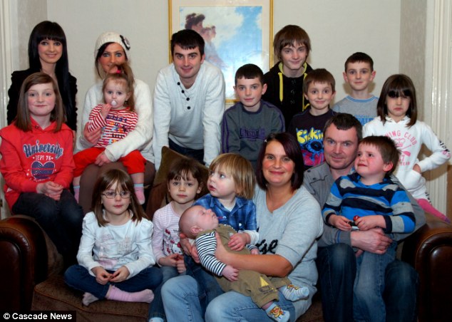
This newspaper article is about a family made up of two parents and 16 children (with the seventeenth on the way). Sue Radford has had a baby with her husband Noel Radford every 17 months for the past 24 years. They're said to be "thrilled" to be expecting yet another baby. Sue first became pregnant with their first child together at the age of 14, and they were determined to keep the baby. After their second baby, they pledged to have even more, and that's exactly what they did.
The couple own a bakery together and both work very hard. They live in a former children's home and use a minibus as a car. They're a working class family. I think this family is a positive representation of a working class family because the parents are loving of all of their children, and the fact they want even more children goes to show how family-orientated they are. Their way of life is often scrutinised by the press and general public, but the family is clearly loving of one another - you can even tell just by looking at the photographs - so it doesn't seem to matter to the family what other's think.
Click here to view the article.
Subscribe to:
Comments (Atom)